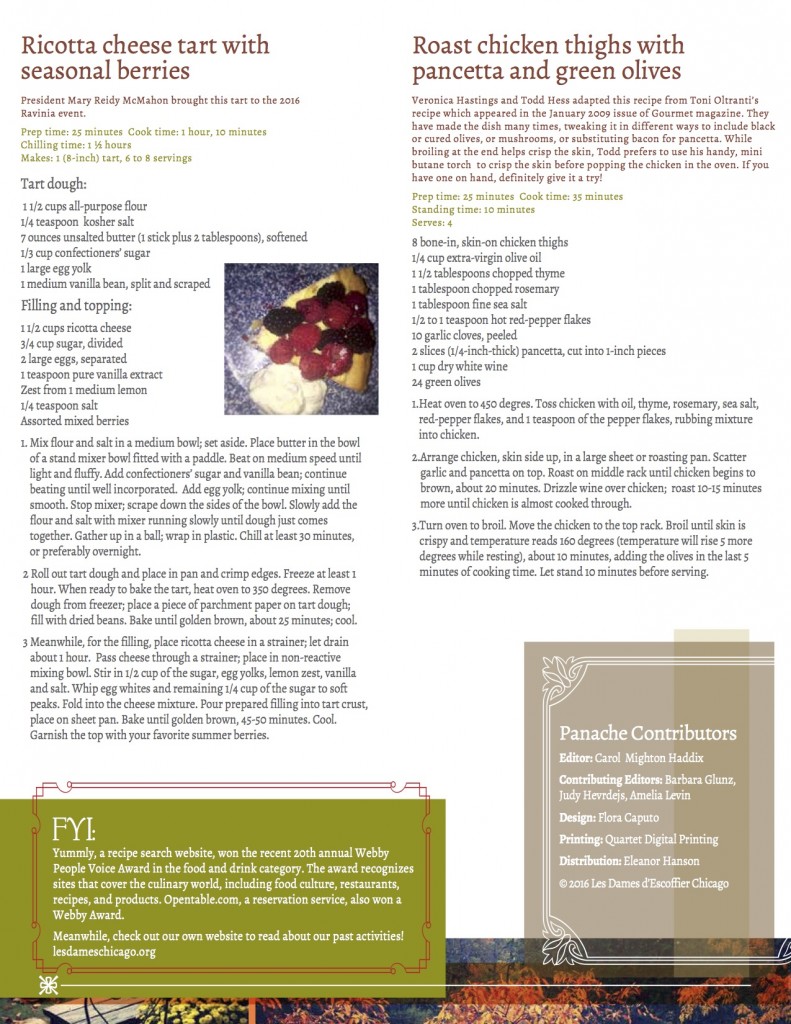
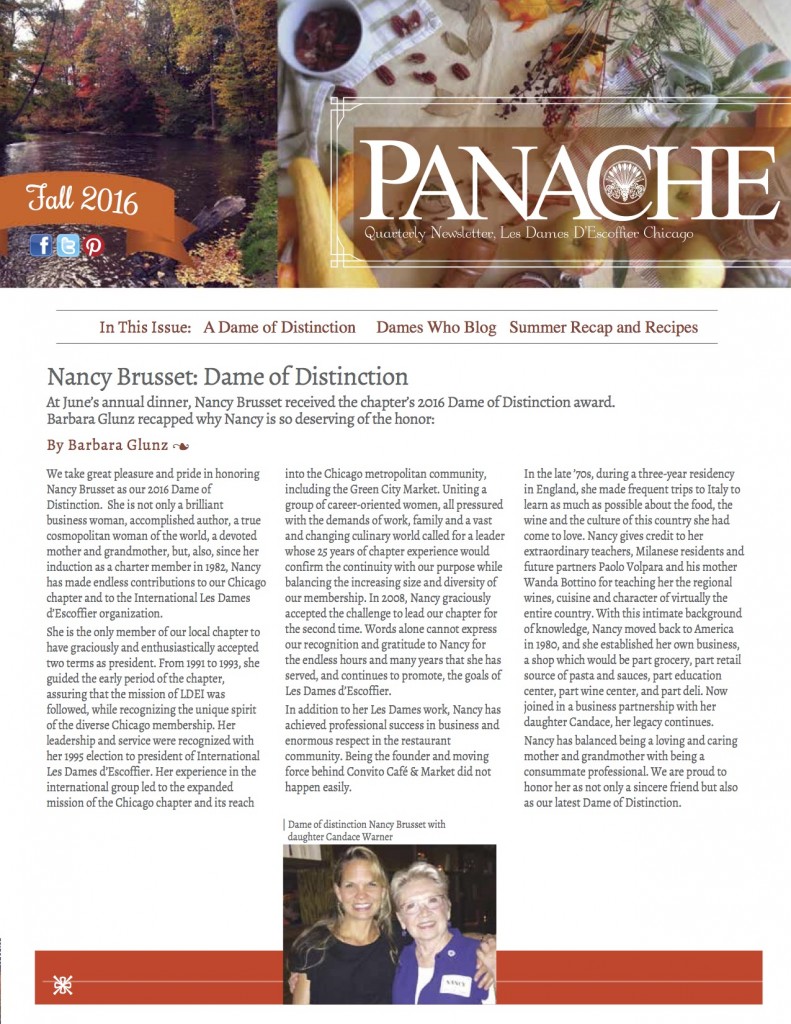
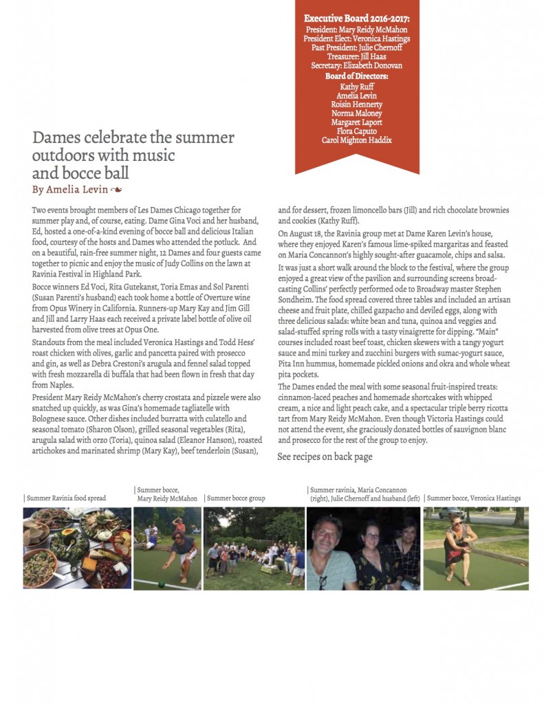
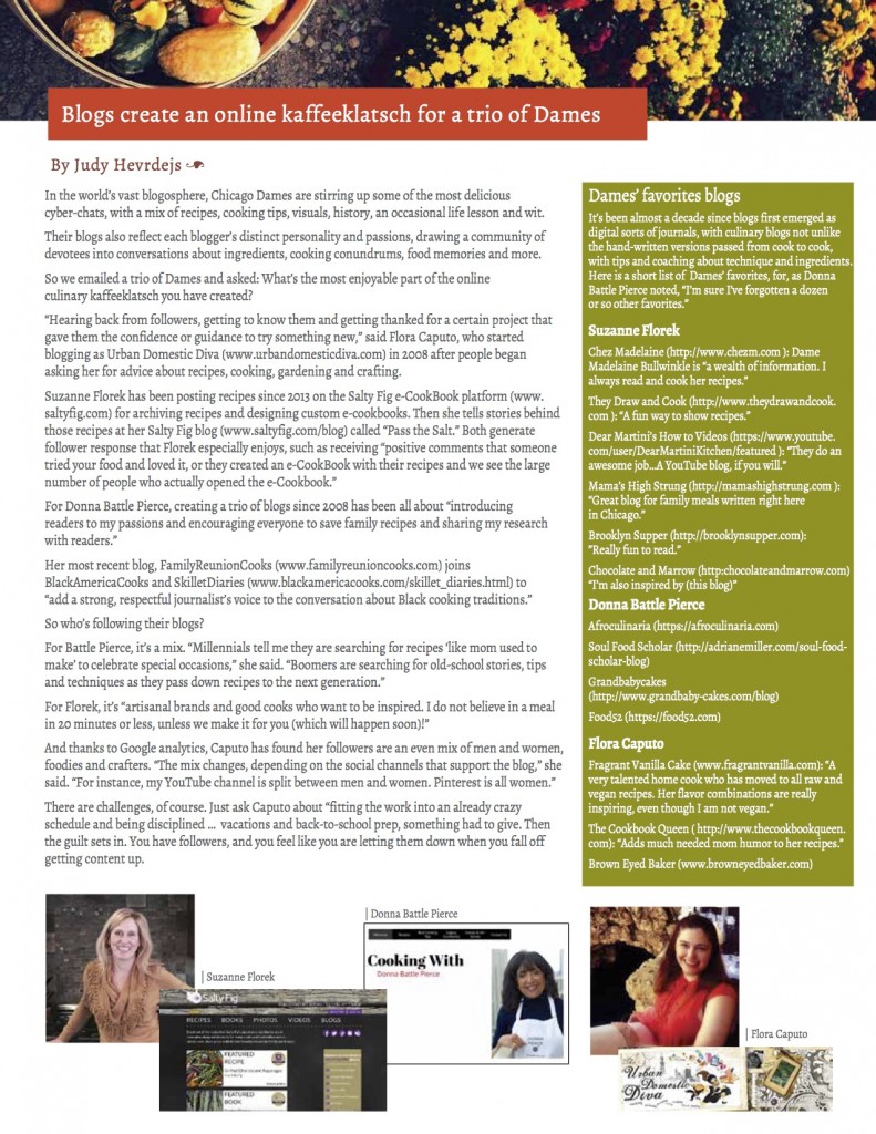
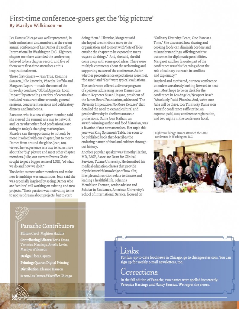
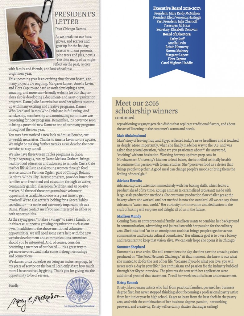
I was asked 2 years ago to redesign the organization’s quarterly newsletter. One of the things I noticed from the previous newsletter was the lack of food and taste appeal. I also noticed we had no masthead or lead lines to entice a reader to even open up the piece. There was also a lack of a template with style sheets and master pages to allow for the designer to quickly update the piece quarterly, while keeping it fresh. After all, this is all volunteer work, so the quicker things can get done, the better!
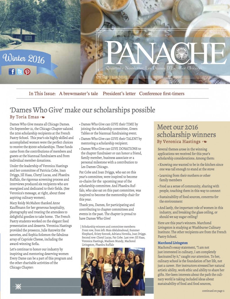
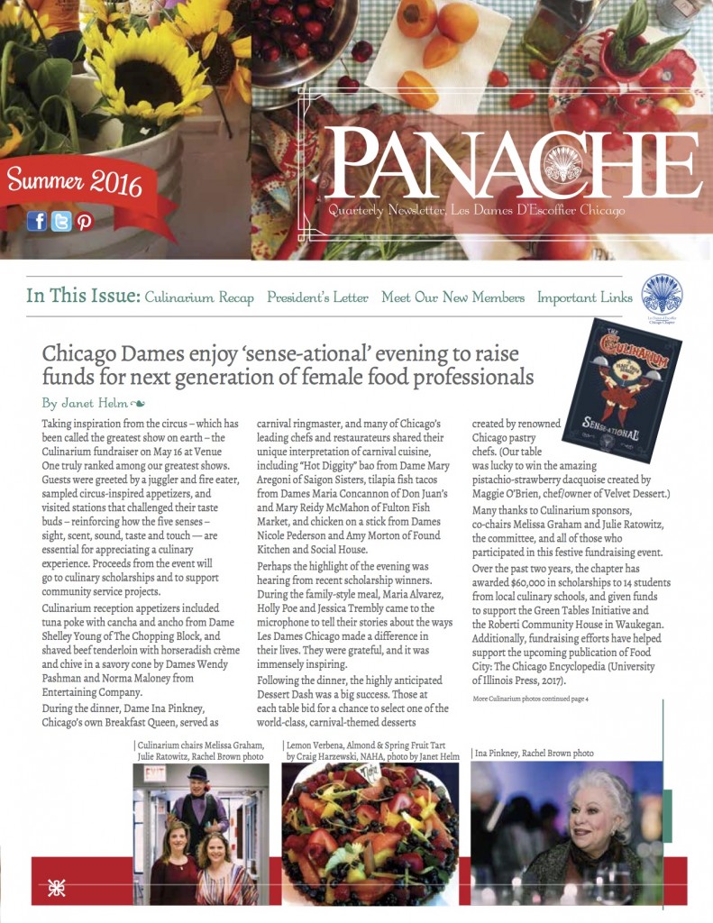
To solve some of my issues (the big one being free food photography) I directed my own photoshoot in my kitchen per season to give the piece more food appeal tied to seasons. After all, it’s good enough for my food blog, why not this?
I allowed the seasonal photography to drive the color palette of the newsletters as well as be in the masthead. The editor loved having the lead story headlines on the front as well. We then create a digital version for our organization’s website to keep things consistent.
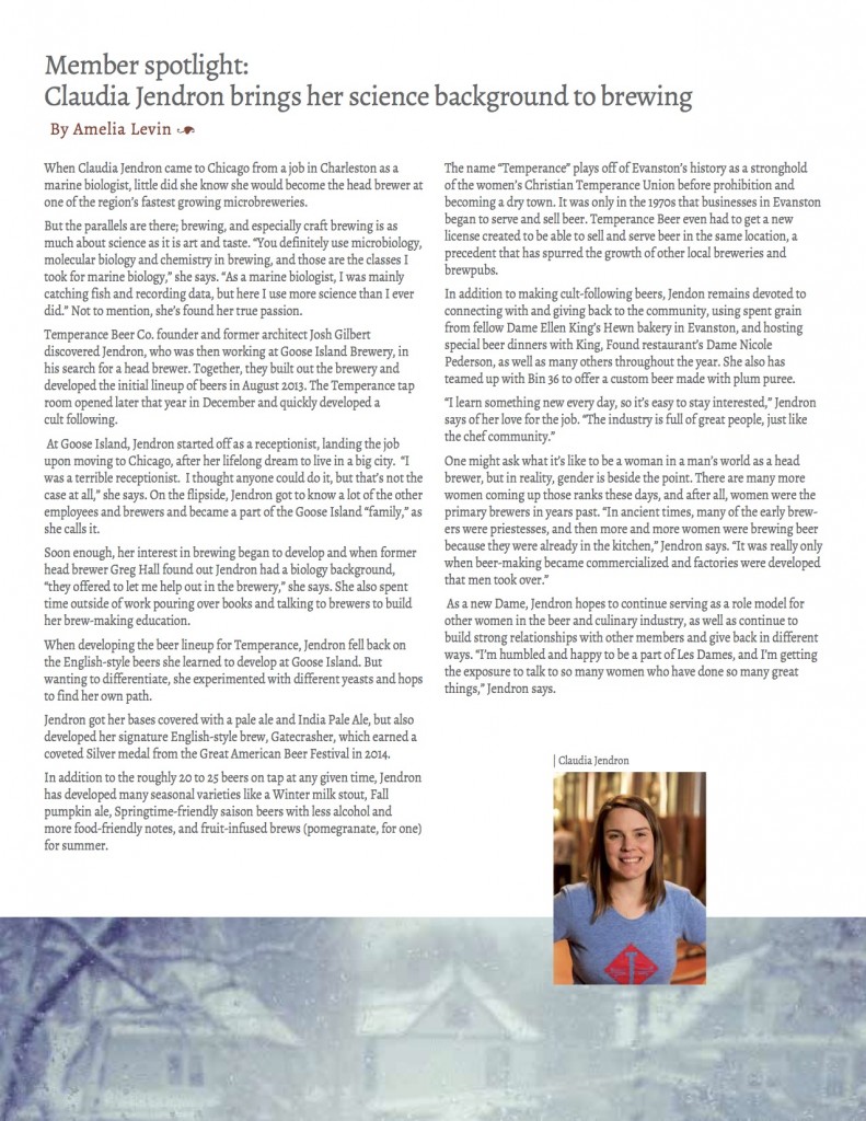
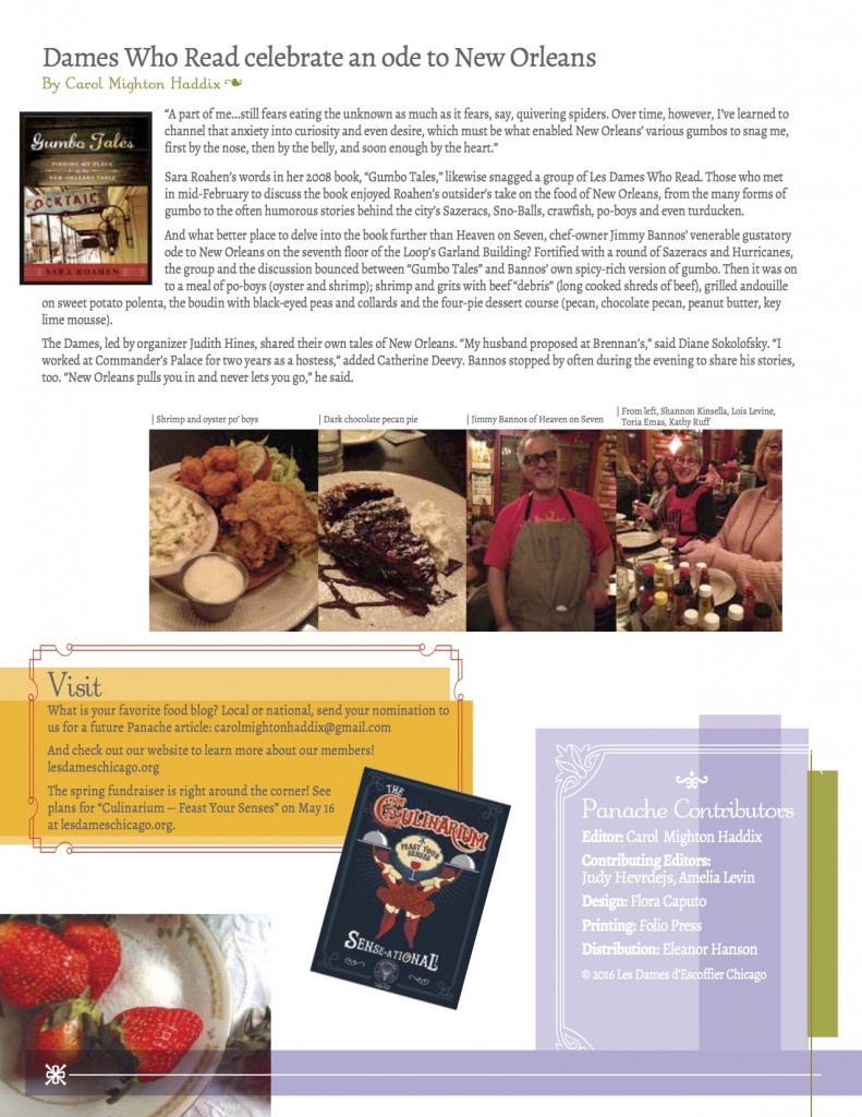
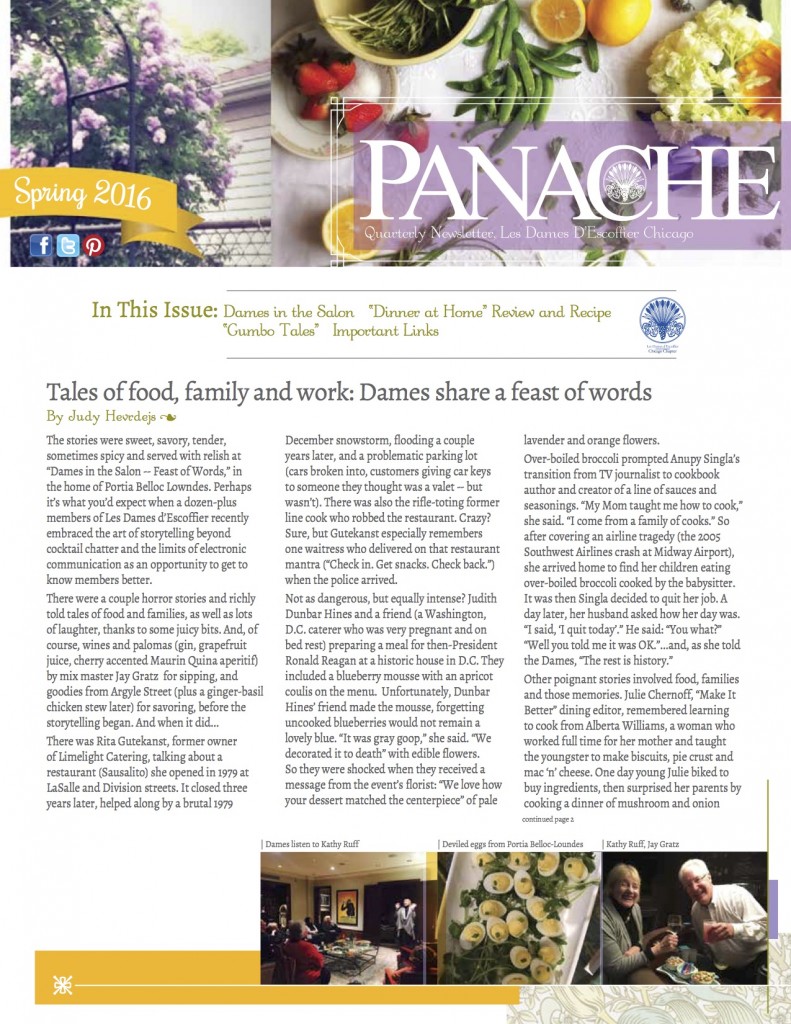
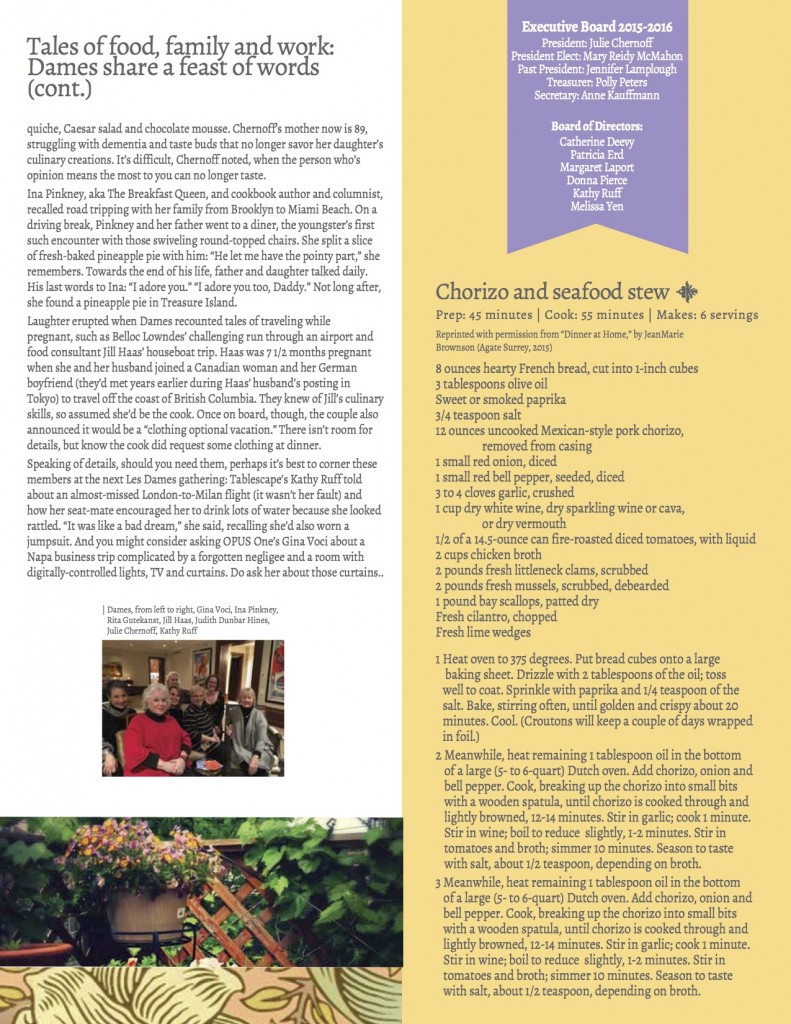
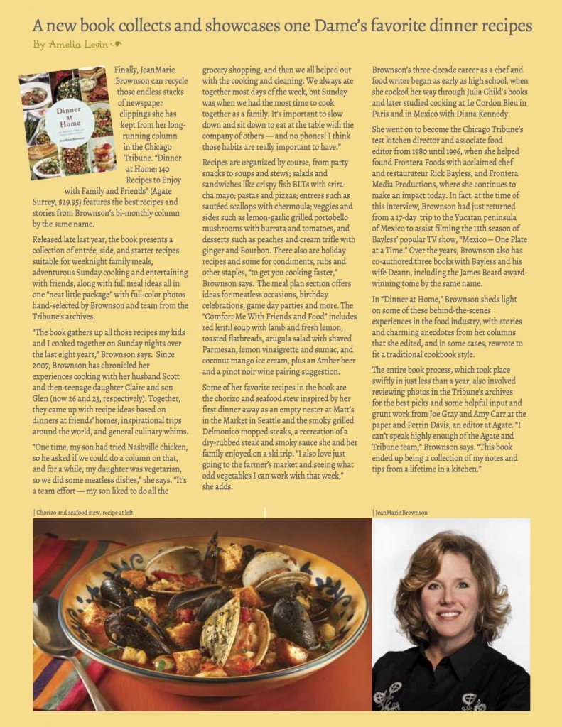
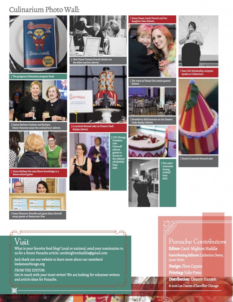
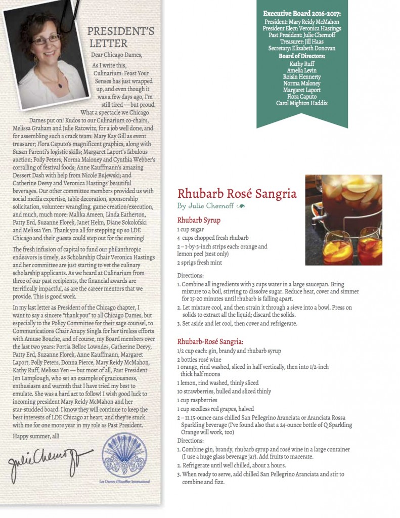
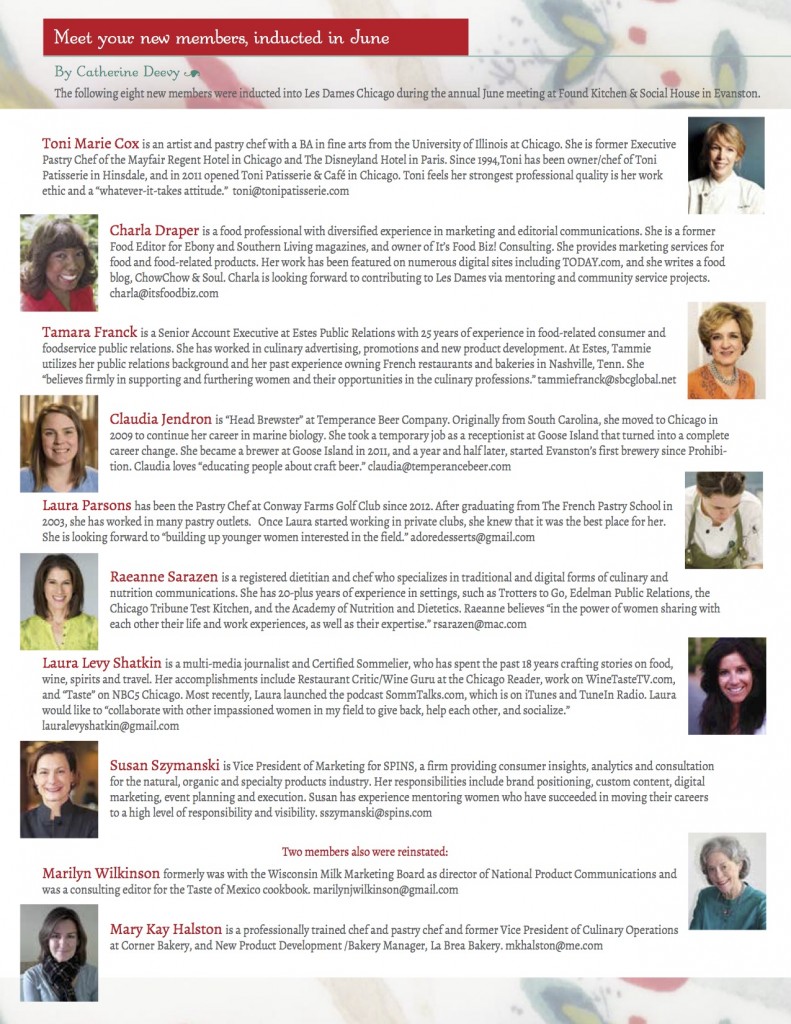
Here are a few newsletters:
FALL:
WINTER:
SPRING:
SUMMER:
Recent Comments